St. Luke University Parish:
Moving Announcement
Initial Drafts:
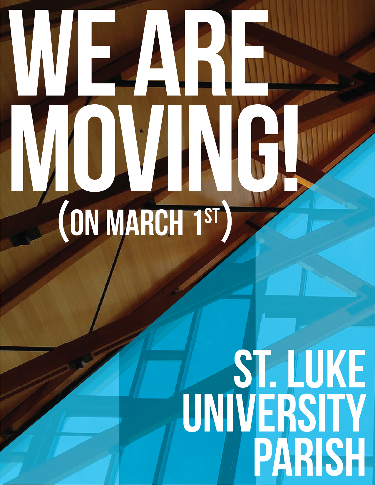
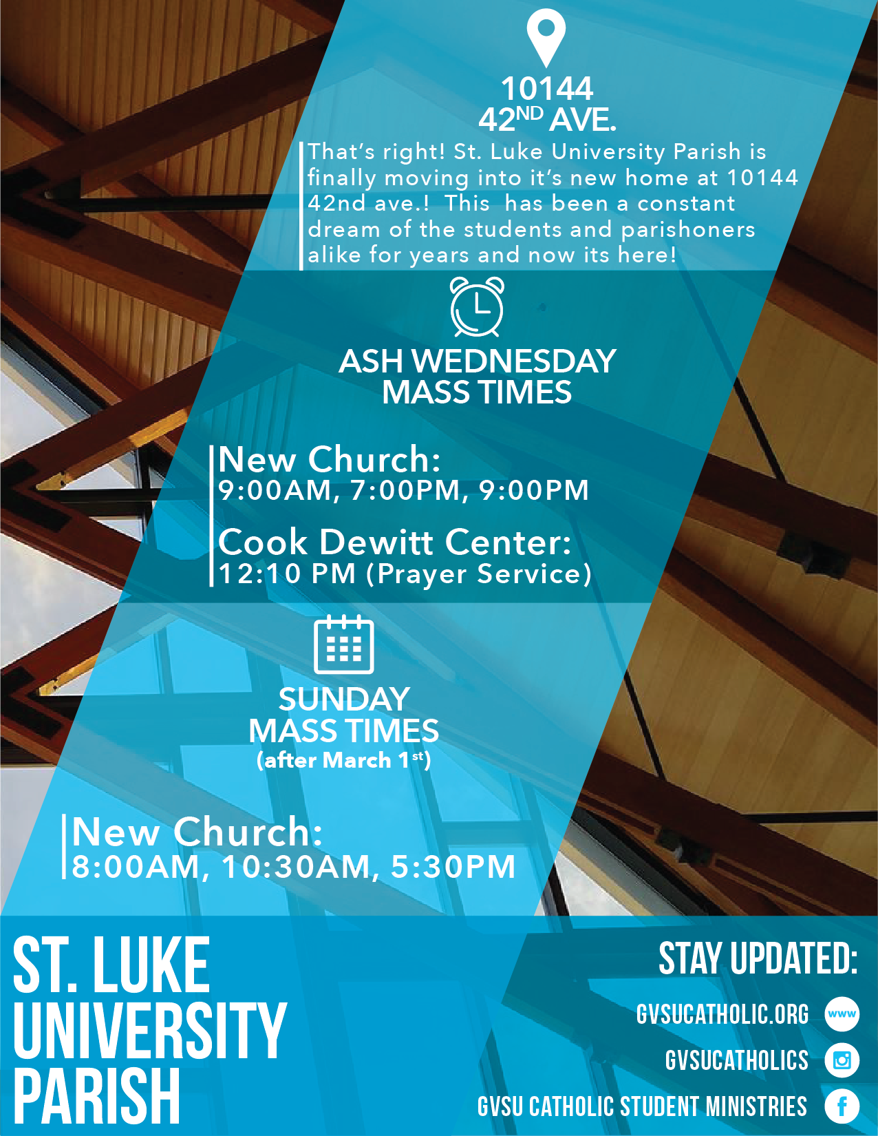
The first used the squares to provide visual flow. This design did constrain all of the info within these boxes, making it seem overly busy.
I found the second design to be a very well done design, though not right for the purpose of this project. It would lend it's design better to event posters in the future.
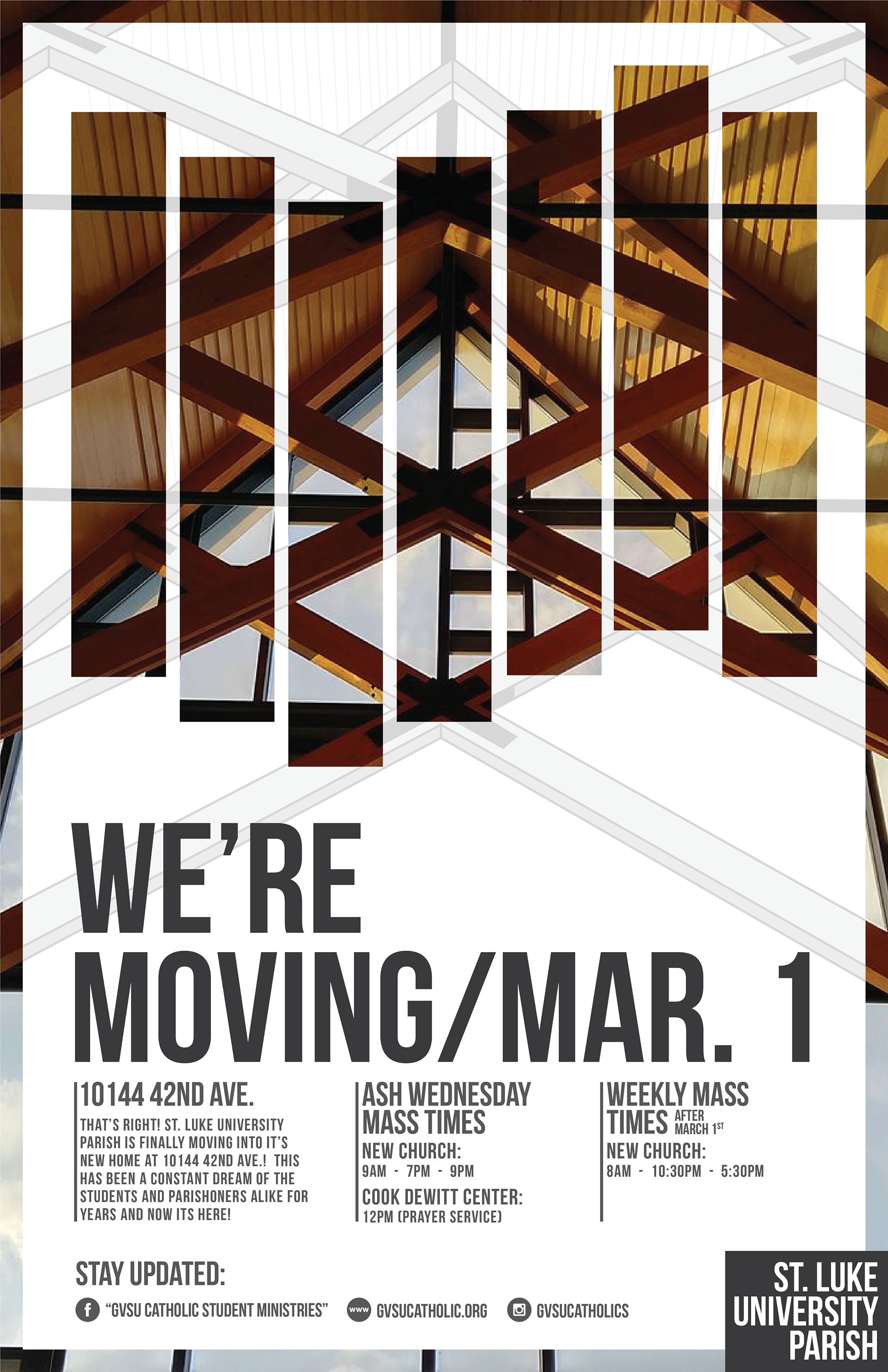
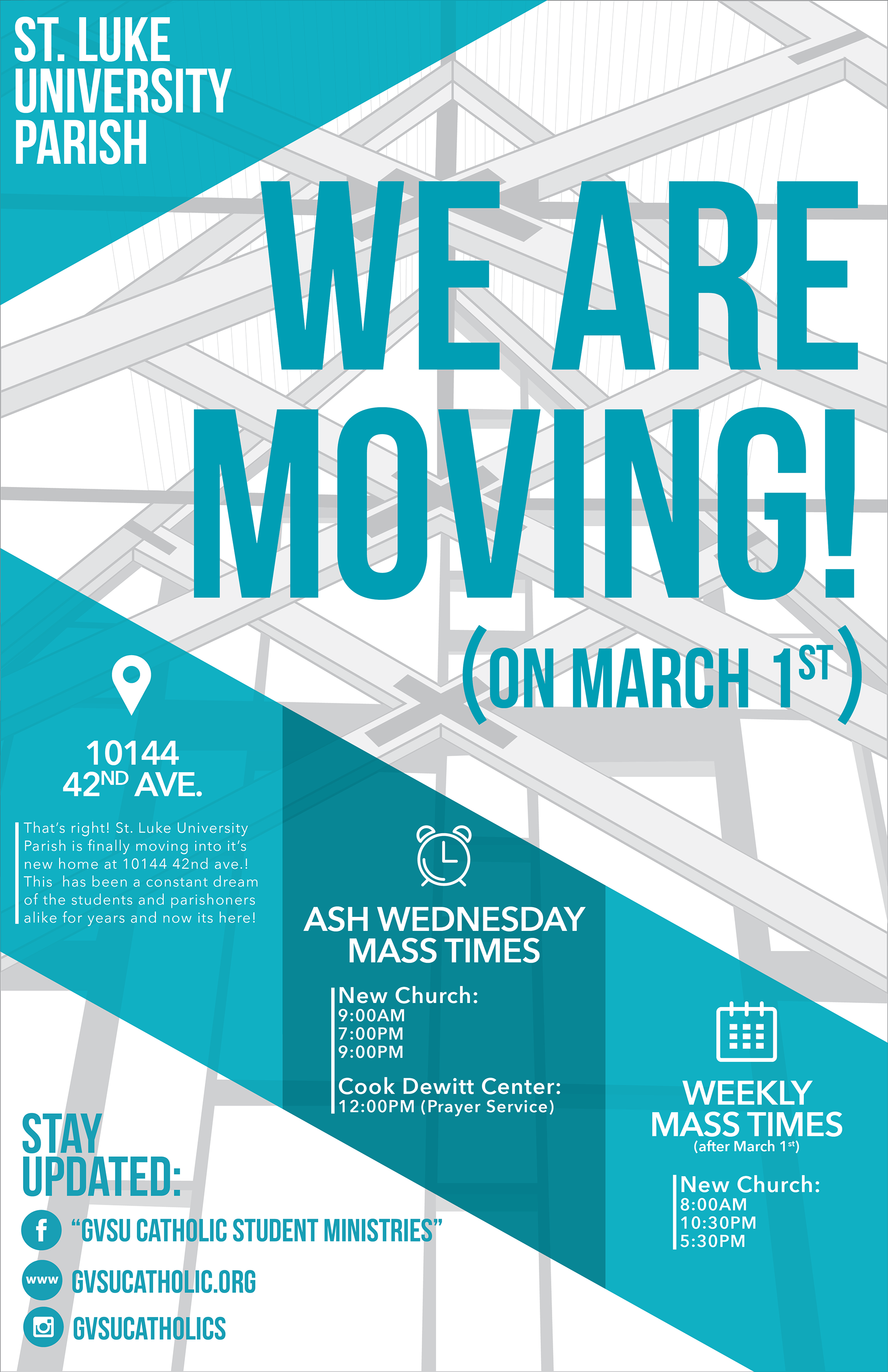
The third design was the initial version that eventually helped to form the final design. Without the photo providing a contrast in the design, it was not eye catching enough for what its purpose was supposed to be.
Final Design:
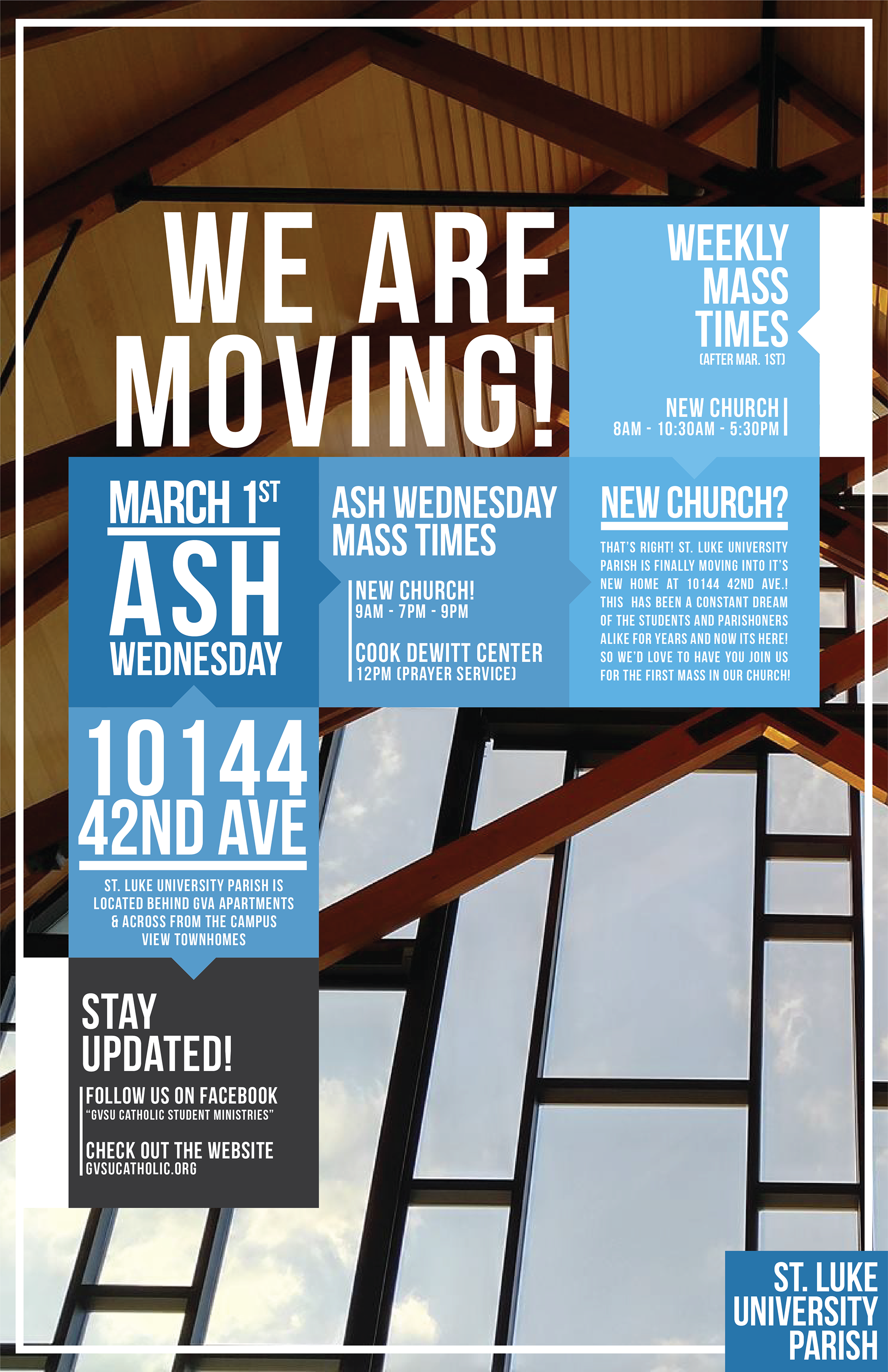
This design, shown below, was chosen for final production. The visual flow of information was easy to follow, it was eye catching, and it fit the purpose of the poster well.
Flyers:
The design was also adapted to fit onto a quarter sheet of an 8.5"x11" for the use of printing flyers to hand out to students.
